AUTHOR: Dr. Azza Osman Bakr
Research Introduction: Color is one of the most important characteristics that play an important role in Visual perception of the accompanying different effects. The warm colors of surfaces help to stimulate and strengthen architectural glass facades, even if minor, how has the ability to move more than cool colors, and transition from cold to warm colors gives the movement inward, while moving from cold to warm colors gives the outward movement. In addition, tonal sequence gives a sense of movement and transition. And the architect should know the required color for the surface because we see color first as an expression of the shape. The use of color can be in two ways, the first use is symbolic. And second: good shape-building integration. So that it appears in color effect glass architectural interfaces through the use and locations.
The Problem: Research deals with the effect of using color in aesthetic taste of architectural interfaces as one of the most important problems affecting the architectural form.
The Aim: A study of the impact of color in glass architecture interfaces through the study of the intellectual concept of color and influencing factors.
Conclusions: 1. To achieve the aesthetic and functional values of architectural glass facades, the theories and aesthetics of color must be studied and influenced by the viewer. 2. The colors used in the façade should be determined according to the functions of the architectural building and the psychological impact of these colors on the users of the building.
Introduction
The color considers one of the most important features that plays an important role in the visual perception as it is accompanied with different effects. The warm colors of surfaces help to activate and brace the glass architectural façades, even if such role was a secondary one. Also, it has the capability to move more than the cool colors.
Using some agitating colors can attract the attention and confirm certain trends. There are some impressions that can accompany the colors. For example, the façades of the warm colors appear rather near from the real, while the façades of cool colors appear far from the real.
The importance of the attraction and contrast appears between the adjacent colors, that the homogenous colors give the sense of unity and tenacity, with accompanied reactions of safety and comfort, while the contrasted colors confirm each other. The sight, moving from the warm colors into cool colors, gives inner movement, while moving from the cool colors into warm colors gives outer movement. In addition, the sequence of colors grades gives the sense of action and movement. Thus, the architect must know the required color for the surface because we see the color first as an expression about the form.
Colors have two uses, First: the Symbolic: We first see the color to give us an impression about the form or an expression of it. Second: It is related to the good integration of the form's structure. As a result, the color's affection appears in the glass architectural façades through the ways and places of use. The color considers a main value in the architectural glass designing as the outstanding design is the one that achieves the functional goal in addition to its beautiful appearance. The object's function is a part of its design as there is no use of an architectural building that doesn’t have a space for use and there's no use of a dark glass façade in architecture through which the light doesn't penetrate. Thus, basically, any design can't be successful without the aesthetical and expedient functions of use.
Research Problem:
The research discusses the effect of color's use in the aesthetical relishing for the architectural façades as one of the most important issues that affects the architectural form.
Research Objective:
To reach studying the color's effect in the glass architectural façades through studying the intellectual concept of colors and the effecting factors.
To reach this objective and to solve the research problem, the following studies should be made:
- First: Studying color’s concept, theories, and characteristics.
- Second: Analytical study of the color in the glass architectural façades.
- Third: Applied study.
- First: Studying Color’s Concept, Theories, And Characteristics
Color Definition:
Color considers the generated physiological effect in the retina that is resulted from a ray that has specific wavelength, whether it was resulted from the colored dye material or from the colored light. The difference of the wave's length makes us able to differentiate between a color and another so, it considers a sense that doesn’t have any existence outside the nerves system of the organisms.
Whereas the colors were often suggested and implemented in the glass architectural façades without the availability of the sufficient scientific experience and the knowledge of the scientific principals and basics to select colors for what colors add of aesthetical effects in the glass architectural façades and their reflected psychological impressions on the human who occupies such space.
According to the availability of several negative experiments which don’t promote the public relishing towards informed aesthetical vision, and such experiments weren't performing their role, function and the required psychological effect. As a result, it is necessary to define the color, its concept, theories, its important significations, and symbols, in addition to study the scientific basics of using colors, their functional, aesthetical and psychological effects in the glass architectural façades, and the reflection of all of these on the human, his vitality, his individual, or communal activity.
For the physical aspect, every surface or form considers a colorless body so, if we focused a white ray like sunray for example, we see that such surface absorbs certain radiant waves according to its atomic structure, and reflects other radiant rays of "spectrum colors". Such reversed waves are seen by eyes, as their color seems coming from the same shape and representing its surface color, then through that it can't see the actual color of some surface unless under a white ray (1: P5).
Color Characteristics – Colorimetry:
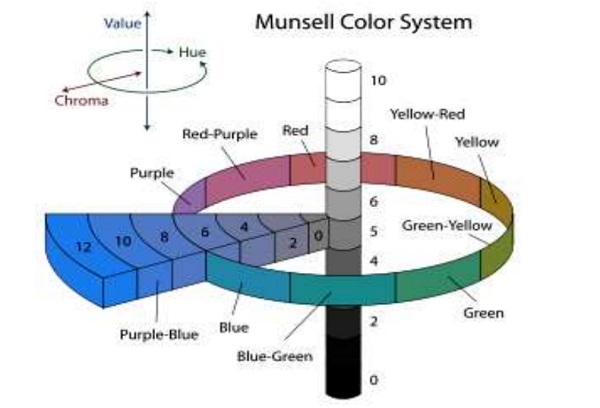
The attempts that are made to measure colors and determine their specifications have been varied, but the most accurate and logical of such attempts was "Munsell's System" that was created by the American scientist "Albert H. Munsell (1858-1918), where he has announced such method for the first time in 1905. The system is about a coloring scale determining accurately the colors' characteristics and dimensions. Munsell has found that to determine color, it is not enough to say: dark red or light green as color is like the box has three dimensions Munsell called them (Hue), (Value) and (Chroma) (2:P10) .
Hue:
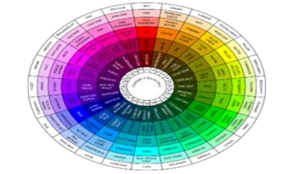
It is the feature that distinguishes between a color and another: "red, green, orange, or blue". While mixing two colors like red and yellow, it gives orange, and this considers as a change in the color's feature, as shown in figure (1).
Value:
It is defined as the relation between the bright and dark color, it means to be dark green or light green.
Saturation or Chroma:
It represents the features grade of the color for the colored atomic number in the space (the color's purity) that can be specified according to the amount of its mixing with the black and white colors as shown in figure (2). (2: P5)
Color Theory:
Color theory depends on a group of concepts related to color and its designing and applied uses that are related to the visual perception concept of the human, his philosophical vision, his intellectual trends, and everything related to the physiological and psychological sides. Such concepts are:
a. Primary Colors:
When mixing these colors, they give us all the features of the "hue", they are three, each of them determines a different feature of the color, and when mixing them they give us all the features of the other color. They consist of two groups: Printers Primaries: consist of red, yellow, and blue. Light Primaries: consist of red, blue, and green.
b. Cool & Warm Colors:
They were divided in the researches of the impressionists painters in the second half of the 19th century into warm and cool colors according to the raised impression by the beholder's sense. Blue and its derivatives consider from the cool colors whereas red and its derivatives consider from the warm colors, while the black and white colors consider neutral status between the warm and cool (2: P7) .
c. Color Harmony:
Harmony can be defined as the good order of the composed elements, whether they were music, poetry, or colors. In the visual experiment, the color's harmony tries to create a view that can be read by eyes through basic theories, which are:
The Twin Colors Harmony (Complementary): It consists between every two colors opposite to each other on the color wheel.
The Analogous Colors Harmony (Triadic): They are a group of the three colors that are next to each other on the color wheel, and the connected lines among them form an equilateral triangle.
The Fourth Colors Harmony: It is the yield of four similar colors group in the color wheel, as the core of two similar colors becomes orthogonal with the core of the other two colors.
The Sixth Colors Harmony: It looks like the fourth harmony, but it consists of six similar colors that are opposite to each other on the color wheel, and as a result forming hexagonal shape leaning on the wheel's perimeter.
The Nature Colors Harmony: Nature provides us with many examples of harmonized colors groups forming a reference of similar coloring systems (4: P4) .
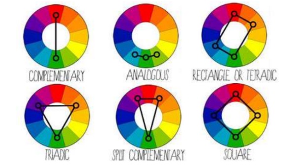
d. Color Contrast:
We can define contrast as the clarity strength among the colors. Such contrast takes several forms. The primary colors are contrasted among each other. The contrasting features weaken through moving to the subsidiary colors of the second degree (orange, violet, and green), and the weakness is increasing through moving to subsidiary colors of the third degree. Also, there's the contrast among colors according to the color's value or according to the color's saturation values, as there's the contrast between the warm and cool colors (5: P10) .
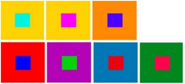
The Influencing Factors in Colors Selection:
There are several factors that affect in the color's selection, such as the functional, environmental, age and gender's factor, the surrounded environment, customs and traditions, and human's health status. Therefore, a group of effects is overlapping; the most important are the functional factor, the psychological and physiological factor and the climate's factor. Thus, it should be taken into consideration to know the colors' characteristics and features, the different systems of colors' order, the coloring plans and their preparation ways.
We find that the surrounding environment as an example has a great effect on the color's selection or preference than the other whether for the culture and living standard and also the nature of the surrounded social standard. Some also relates between the climate and the color, so we find that in the countries of the hot climate, their people prefer the bright warm colors, while in the countries of the cold climate, they prefer the inactive cool colors.
For the gender's factor, males of the same age prefer too much colors different from the preferred by females, in other words, there may be males and females preferring or hating the same color, but in different ages, there are preferred colors greatly by males which we can call masculine colors such as (orange, yellow, green, and black), while females preferring (blue, sky-blue, pink, and white), and there are lovely colors for both genders almost at the same rate such as (red, yellow, lemon, and violet) (3: P3).
Colors Psychological & Physiological Effects:
First: The Psychological Effect: the psychological effects are divided into direct and indirect effects. The direct effects are those that are shown though the human's behavior such as fun, grief, humor or silly, while the indirect effects are changing according to persons. For example; orange color represents heat and warmness, but objectively; it represents the fire and sunset. Also, colors affect the soul and then causing feelings that lead to vibrations, some have the comfort and tranquility feature, while the others have the fatigue and disorder features. Therefore, we see the colors effect can lead to a case of joy and fun or grief and depression.
Searching in the color's psychology is a new field that can be added to whenever the psychology's research could be progressed, as the psychological impact relates to the accurate awareness of the man's soul.
Second: The Physiological Effect: it is the color's effect on man's body and his vital organs like the effect of blue to calm the nerves system, and the effect of red to increase blood pressure because it causes fast heartbeats (5:P15) .
That will show in the next study which confirm the Psychological & Physiological Effects of color.
Second: Analytical Study of the Color in the Glass Architectural Façades:
Color comes as an element of the formative unit in architectural façades including different other sides of the form, such as the configuration, tendency, volume, material, touch and light.
Selection of Architectural Façades Color:
In some areas, there are directions for the architectural façade's color to change the basic color that the developers should follow, but the problem that despite of the directions, still there are not harmonized colors that are called "the color pollution". In such part of the research, we will find that the fact of what the human felt towards façades colors are different from one to another and the purpose of this study is to study the selection of a group of colors fitted with the architectural façade.
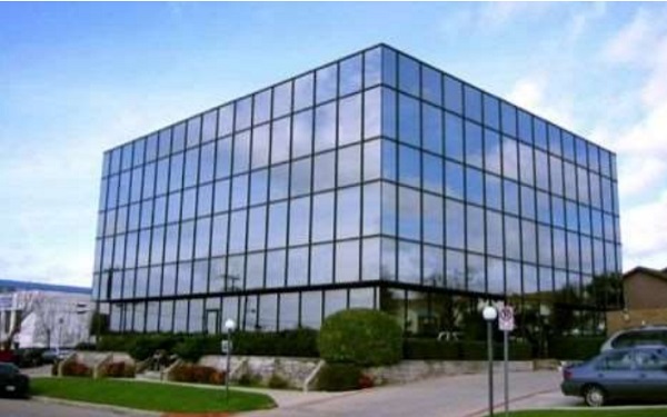
First Study: Usaha Jayamas Bhakti PT Building in Indonesia:
It is a rectangle building free of design and colors, as it was classified by one of those interested in the environmental art that the building is one of the most ugly glass façades at all. Figure number (5).
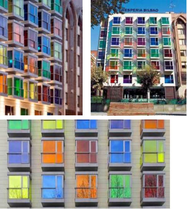
Second Study: Hotel Hesperia in Spain:
The basic idea of the design of this façade is to make a unique façade by making prominent boxes of different colors glass in the façade by using warm and cool colors in random order of green, orange, blue, yellow, red and violet. Figure (6).
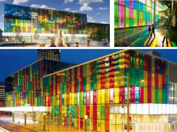
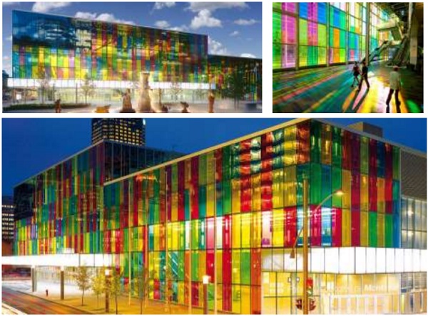
Third Study: First: Colored Glass at the Palais des Congrès:
Colored glass in architecture is the vibrant Palais des Congrès in Montreal, with its enormous façade of diaphanous colored glass. This façade was created with Solutia’s Vanceva Advanced Solutions for Glass interlayers. Essentially, a colored interlayer of Vanceva polyvinyl butyric (PVB) is laminated between panels of glass. The result is both a strong structure and durable color that won’t fade over time. This façade projects colored light through the grand entry, changing with the angle of the sun throughout the day.
From the outside, the color and structure brings life to a district that bridges historic Old Montreal with markedly contemporary downtown Montreal. While it is typical of modern architecture to connect interior and exterior spaces with glass, this design provides a unique twist on that concept. Instead of creating a condition of literal continuity between each realm, the skin’s colorful membrane creates a minimal sense of opacity that, in effect, visually establishes parallel spatial worlds. Figure (7).
Second: IMI International Management Institute Kolkata / Abin Design Studio:
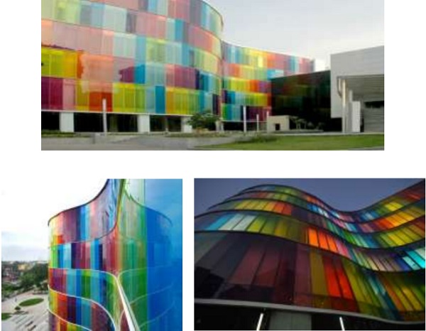
The sky with its various states and ever changing colors is one of the most dynamic elements of nature and is what has inspired the built form façade. The colored laminate with Vanceva PVB glass on the façade follows no repetitive pattern and is symbolic of the unpredictable nature of the sky. It also represents the vibrancy of today’s youth. The architectural language of the built form is a representation of this.
The colored façade gives it a unique identity and is the first of its kind to be built in India. The site was a huge constraint and dictated linear planning. Special efforts were made to ensure create non-monotonous spaces which did not follow expected linear pattern. Circulations spaces and spill out zones have been created along the curved glass façade giving them a more interesting and dynamic feel. Emphasis was given to interaction points not just for students but also for the faculty encouraging exchange of knowledge and ideas at all levels. Figure (8)
From the previous studies, we find that the color in façades with a correct and good way is positively affecting on the receiver's soul. The architectural designing generally and the façades designing specifically have benefited from the scientific studies in the man's psychological and physiological fields, and in the visual perception and the aesthetical relishing fields of the formation elements in the space as this could create basics and standards for the colors use in the glass architectural façades.
By looking at the previous studies we can clearly see that colored facades affect positively on the people who see the building and also those who use it.
So the applied part of the research will be a transform in a building’s façade by using colored mosaic glass.
Third: Applied Studies:
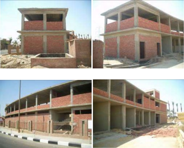
Applying on the façades of the shops building (Commercial Mall), Ain Sokhna Road
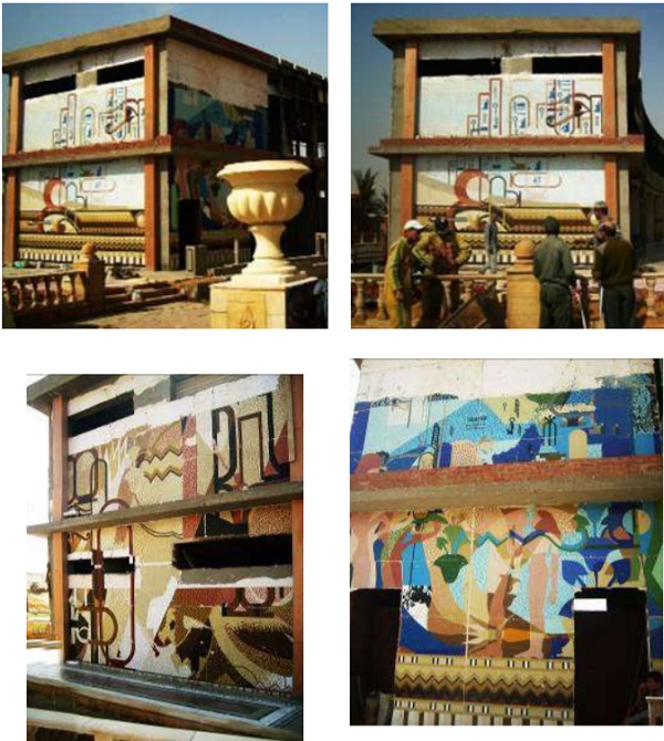
The building, the subject of the study, is located in Cairo, Ain Sokhna Road, among the beautification project of the road to highlight the ancient Egyptian art and the pharaonic culture in a modern and abstract way by using colored glass mosaic Figure (9).
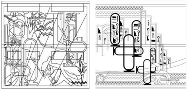
After conducting a field study and taking the sizing of the project, we started setting some designs that have abstract Egyptian pharonic nature.
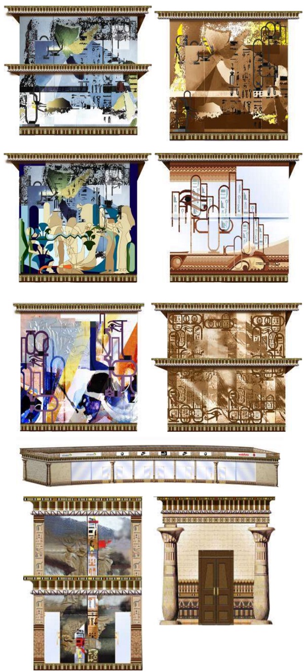
After approving the designs, the design will be under working drawing in preparation for implementation and after that the installation will be done on the facades as shown in fig (11)
Conclusions:
1.The color has definitions,characteristics and theories that should be known to realize the easthetical and functional values of the glass architectural façades.
2.The color is one of the basic affected elements in façades design so, we should consider the psychological and physiological aspects of the color in the architectural design.
3.Colors are determined according to the functions of the architectural building and the façade expressing them, to consider the colors that fit such functions according to securing of the best level of the psychological and physiological health of the receiver.
4.The psychological nature of the building users are being studied so as to consider their cultural knowledge and intellectual trends, in addition to their artistic and aesthetical desires.
References:
Books and Articles:
1.Anderson, Feisner, "color – how to use color in art and design ", Laurence King publishing Ltd, second edition ,2006.
2. Debs Wazit, Hossam – Moaz, Abdel Razik, The Functional & Aesthetical Dimension of Colors in the Contemporary Interior Design – Damascus: Damascus University Magazine for the Engineering Science24th volume- 2nd edition, 2008.
3. El Sakr, Eyad: Colors Philosophy Book, Amman- Jordan: national House for Publishing & Distribution- 1st edition, 2010.
4.Farber, Birren, "The Elements of colors" New York: Van Nostrand Reinhold, 1970.
5. Hamouda ,Yehia, "Colors Theory", Cairo- Egypt: Dar El Maaref-, 1990.
Websites:
6.Archdaily, http://www.archdaily.com/115983/imi-international-managementinstitute-kolkata-abin-design-studio .(2 December 2018)
7.Architecture, http://www.bilbaoarchitecture.com/portfolio-items/hotel-hesperiabilbao/ (1 October 2018)
8.Housberg, Paul, Glass Project, https://glassproject.com/2012/11/29/colored-glass-at-the-palais-des-congres/ (1 November 2018)
9.Lloyd, Alter, Treehugger http://www.treehugger.com/sustainableproduct-design/can-an-all-glass-officebuilding-really-be-consideredgreen.html .(20 November 2018)

