
Article Information
- Digital Object Identifier (DOI): 10.47982/cgc.8.409
- This article is part of the Challenging Glass Conference Proceedings, Volume 8, 2022, Belis, Bos & Louter (Eds.)
- Published by Challenging Glass, on behalf of the author(s), at Stichting OpenAccess Platforms
- This article is licensed under a Creative Commons Attribution 4.0 International License (CC BY 4.0)
- Copyright © 2022 with the author(s)
Authors:
- Catie Newell - University of Michigan
- Ryan Craney - University of Michigan
Abstract
Color Depth is a material-based research project investigating the optical and structural properties of thick glass. The research is driven by an interest in optical gradients of transparency and color, which are designed through a manipulation of geometric form and composition. These qualities can be attributed to the interrelated optical effects created through reflection, refraction, and volume color, in direct correlation to the geometry of individual glass pieces and overall glass assemblies. An example of this can be seen in viewing a monolithic volume of glass that would appear to change color by varying the depths of its form. This concept was originally discussed in Josef Albers’ Interaction of Colour, and applied more specifically to glass in recent essays by Heike Brachlow.
Color Depth utilizes this phenomenon of perceived color variation to construct and analyze architectural glass forms in both physical prototypes and design speculation. To evaluate architectural design opportunities, a multi-objective optimization workflow simulates and evaluates varying glass colors, forms, and compositions to achieve a desired visual effect. Additionally, the digital optimization process reveals patterns and visual effects that further the understanding of optical gradients when applied in an architectural context with various seasonal and diurnal environments. Keying into the geometry of glass– to deploy changes in color, darkness, or translucency—Color Depth ties together the physical attributes of a material system with its surrounding light.
1. Color and Geometry
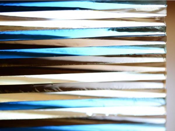
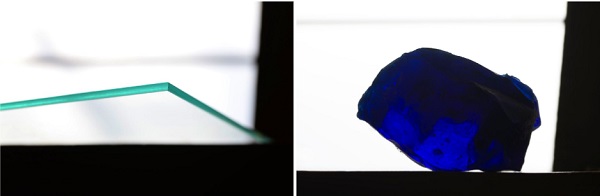
In an architectural setting, glass is most commonly selected for its qualities of transparency and thinness. Typically placed in facade or partition systems as flat pane windows, glass is usually intended to allow lights and views through it with minimal distortion. As such, the evaluation of characteristics of available glass panes often focuses on optical clarity. While the formation of a flat pane provides desirable visible transparency or lightness, thicker elements demonstrate optical shifts that occur as a result of the increasing thickness of glass. This can be easily witnessed by viewing a clear pane of glass on edge. The darker green-blue results from the compounding optical effects within the material as seen across its thickness.
The work of Color Depth is interested in the transitions from clear to opaque, as seen across changing thicknesses, with color variation as a resulting effect. These effects can be attributed to the interrelated optical effects created through reflection and refraction in direct correlation to the geometry of individual glass pieces and overall glass assemblies. If a volume of glass, for example, is a monochromatic color, and the form of its composition varied in thickness, the glass would appear to change color. This is known as volume color (Albers 1963) and it is most noticeable across changing thicknesses of colored glass (Brachlow 2012). Generally speaking, volume color describes the condition where colors appear darker across a greater thickness or volume. This is due to more color being absorbed by the material for a given wavelength of light.
This phenomenon is instrumentalized in the geometric forms tested for Color Depth. By focusing on the correlation between geometry and the resulting optical effects of opacity and coloration, the material’s application within an architectural setting is reconsidered whereby thickness determines color appearance.
- Varying thickness provides the opportunity for adjustments to the following:
- Perceived colors linked to the thickness of the glass
- Quantity of light transmission as depths correspond to transparency and opacity
- Variation across vantage points which could be coordinated to visual privacy
- Changing appearances based on movement by the viewer or the light source
By controlling the thickness (or thicknesses) of glass, the material alone can choreograph the transmission of color, light quantities, and visual clarity or opacity. The effects of color and opacity variation are not perceived across the standard uniform thinness of flat pane windows.
2. Prototypes: Eclipse and Test Light Forms
2.1. Project Description
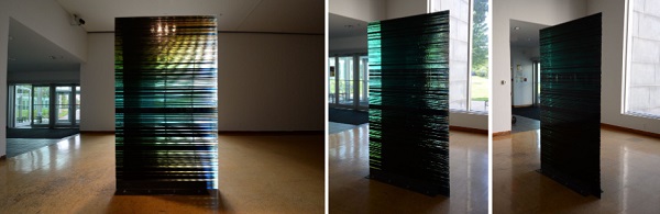
Earlier studies within the project provided a rich complexity of light behaviors that, in compilation, created numerous optical effects. The largest test piece, Eclipse, is a prototype for an architectural wall that highlights the use of glass in compression and the optical effects of color shifts based on refraction. In Eclipse, colored float pane glass is stacked as a right triangular prism. Visual shifts and color changes are created based on the occupant’s position or movement in space relative to the solid architectural object and the qualities of available light (Newell 2019).
2.2. On Edge Color Shifts
The development of Eclipse began with a study of color shades and color transformation as seen on edge of existing float glass panes. Uniformly colored glass was selected. The uniformly colored glass was also observed with and without a mirrored film coating.
The selected glasses were from Pilkington Glass:
- Pilkington Eclipse Gold (clear glass with mirrored coating)
- Pilkington Eclipse Sunset Gold (amber glass with mirrored coating)
- Pilkington Arctic Blue (blue glass)
Notable shifts occur across the colors as the viewer moves parallel to the edge surface of a stack of glass. As the viewer changes position and/or line of sight, several visual factors compound in dramatic shifts in colors. This is due to the shifting quantity of thickness of glass relative to the direction of the eyesight, the layering of neighboring colors, and the presence or absence of mirrored surfaces within the stack.
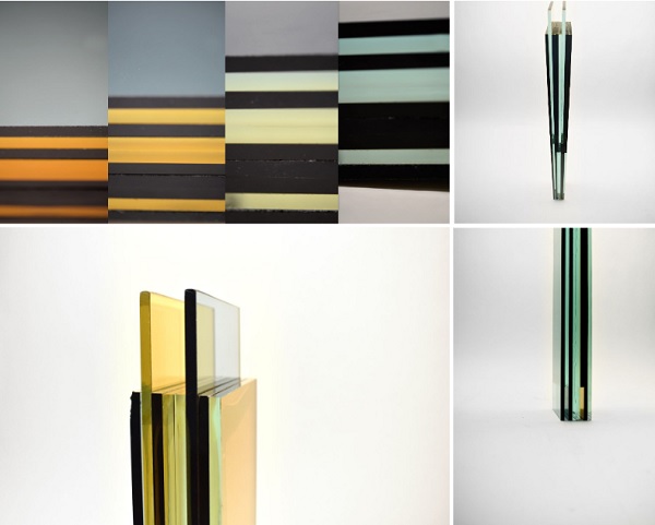
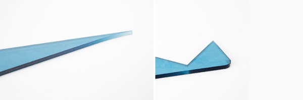
Cutting the panes of glass into various shapes also revealed an alteration to the appearance of the color, the volume color, based on the cross section of the pane of glass at that segment of the geometry. Most notably, when cut into triangular forms the shift in color, as seen on edge, is constantly increasing or decreasing in hue, moving from dark (at thicker moments) to light (at very thin sections).
Recognizing these color shifts obtained both by moving parallel to the outer face of a stack of glass and altering the quantity of material that is beyond any point on an edge of glass, Eclipse was created by cutting triangles out of standard float glass panes.
The final geometry, a right triangular prism, was based on creating zero waste cuts with the original supplied panes from Pilkington Glass.

2.3. Compounding Optical Attributes
Eclipse was stacked in a gallery space, with the hypotenuse of the triangle placed near to an existing window to the exterior. The long edge of the triangle, opposite the hypotenuse was parallel to the window, with the short edge facing the entry door. With this orientation, upon entry, the visitor would initially see the short edge of the triangle. This appears quite dark as the thickness of glass beyond that edge is at its deepest. As the visitor moved around Eclipse, the appearance of the colors would change dramatically based on their position relative to the triangle and their eye height. Relative position to the triangular form determines how deep the glass is beyond their view. This would provide shifts from nearly clear or light colors to very dark colors (Newell 2019).
The position in height (the location of the viewer’s eye) would determine colors that were formulated based on the stacking pattern. The viewable color of the glass and the present light (artificial and natural), and reflections. In general, the glass would be seen as shades of green straight on, and shifting to yellow, golden, and orange higher and lower than eye level. This is based on the color of the glass, the qualities of the light, and mirrored reflections.
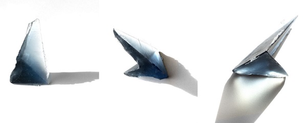
2.4. Test Light Forms
After further study of the optical effects demonstrated across the Eclipse prototype, smaller cast forms were created to verify findings, supplement tests for a color sensor, and consider geometric forms that shift in thickness across multiple dimensions.
Forms were created that allowed for testing:
- altering a shift in thickness across multiple directions within the same form
- thicknesses that overlap with an airspace in the middle
- relative location of thickness based on different orientations in space
- spans of thinness
3. Correlating Geometry and Color
3.1. Digital Simulation
As learned in the previously described prototypes, color depth can be leveraged for its optical effect in glass design. To better understand the capabilities of color depth, a digital simulation tool was developed to document, simulate, and apply the relationship between geometry and color in glass.
Several tools already exist for optically-accurate rendering of glass materials (Jakica, Kragh, and Besse 2019). These tools, also known as 3D rendering engines, can produce a photorealistic visualization of almost any material or scene; however, the incredible complexity of a photorealistic render requires significant processing power to compute. Developing a lightweight tool specific to the optical effects of color depth allows for a more streamlined approach to simulating glass materials. The benefits of this type of program are apparent when utilized in an optimization workflow, where simulations are required to be run several thousand times in quick succession to achieve an optimal solution.
3.2. Empirical Analysis
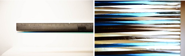
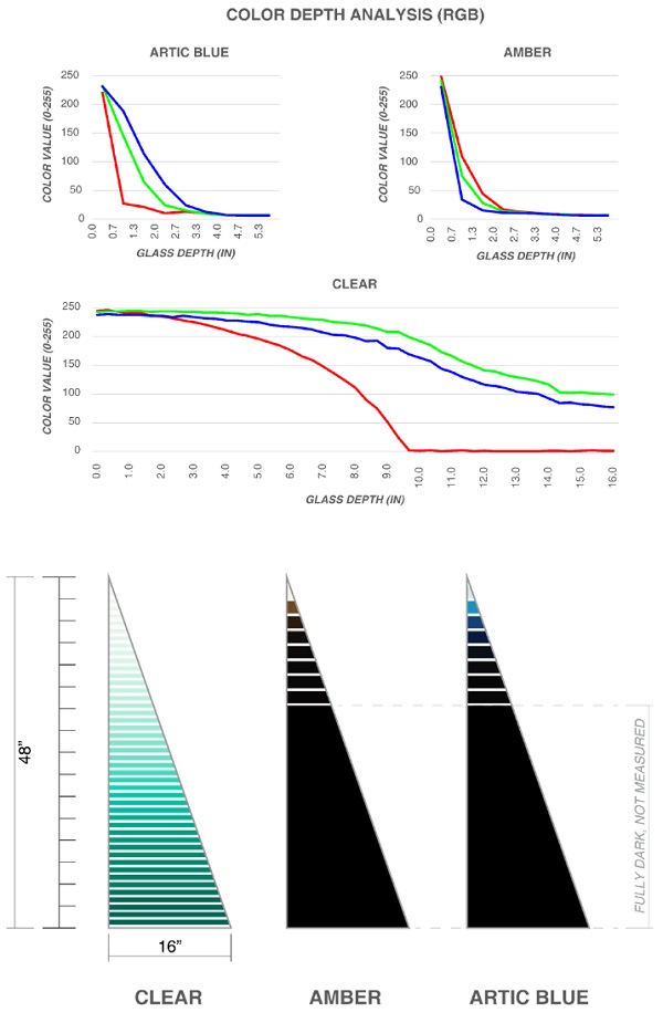
The development of this tool began with an empirical analysis of color depth with the goal of formulating the relationship between perceived color and glass thickness. Measurements were taken from three different colors of float glass: clear with a mirror coating, Pilkington Sunset Gold, and Pilkington Arctic Blue. Each pane was cut into the same triangle shape, uniformly lit in a controlled environment, and oriented with the tapered edge perpendicular to a camera (Fig. 7). Photographs of each glass panel were sampled at ½” intervals in photo editing software for their red, green, and blue values (0-255), which were graphed and approximated into a curve representing the correlation of glass depth to color value (Fig. 8).
The results illustrated a non-linear relationship between glass depth and color value. Additionally, the appearance of this curve varies based on the color of the glass, with the Arctic Blue and Sunset Gold exhibiting an inverse relationship, while the clear glass exhibits a more convex curve. Lastly, it should be noted that the perceived color depth also varied based on color temperature and intensity of the lighting conditions, therefore the empirical results could be further improved by adding measurements under additional circumstances.
3.3. Color Depth Algorithm
Using the collected empirical data alongside simple ray-tracing techniques, an algorithm was created to simulate the perceived visual color of light traveling through glass geometry. The algorithm was developed as a tool in Rhinoceros (Robert McNeel & Associates 2018) using Grasshopper visual scripting (Rutten 2018) and Python programming language (Python Software Foundation 2020). It functions through the input of one or more closed, two-dimensional geometries, each assigned a color corresponding to the colored glass material.
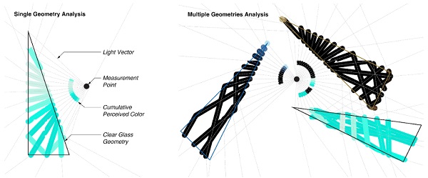
The perceived colors were simulated as a radial array of vectors intersecting with the input geometries. Data for each intersection was stored and the index of refraction and color of each glass geometry was collected. The refraction and/or reflection angles of each vector was calculated at each intersection using Snell’s law and the critical angle. The algorithm simulates the intersections for each light vector within the vicinity of the glass geometries up to a predetermined number of intersections.
The perceived color for each light vector was calculated using the collected data. Intersection points were connected with line segments in sequence to generate a polyline representative of the light vector travel path. Each segment contained with a glass geometry was assigned a color value by translating its length into a RGB color value, using the empirical formulas described previously. The resulting perceived color is then calculated through subtractive color mixing (Burns, S.A. 2015) of each color value along the light vector. Both the individual segments and cumulative light vector color values are overlaid on the Rhinoceros model for visual inspection of the results (Fig 9).
It is important to note that the simplistic nature of the developed color depth algorithm is critical to reducing its computational complexity. Taking this approach allowed numerous design iterations to be quickly run as a part of a multi-objective optimization workflow.
3.4. Multi-Objective Optimization
A multi-objective optimization workflow was introduced into the research in order to explore different visual effects in order to design the form and composition of glass geometries to achieve specific conditions or experiences. The multi-objective approach allows multiple desired outcomes to be included in a single solution space. For example, when viewed from one side the glass geometries could appear opaque, while the view from the opposite side of the geometries could appear transparent, would comprise two simultaneous objectives that can be accounted for.
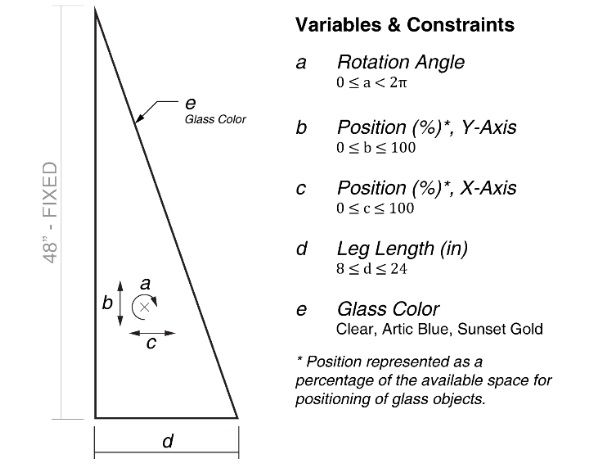
The solution space of the optimization workflow was defined by the size, positioning, and color of each triangular glass geometry. For the purposes of this study one leg of the Eclipse triangular form could be shortened, the geometry rotated or moved within the spatial constraints, and assigned a glass material color (Fig. 10). These variables were used in conjunction with the developed color depth algorithm to evaluate potential designs.
An early case study sought an installation design with the objective of contrasting perception relative to a viewer’s location within the installation space. In particular, the fitness of each design permutation was evaluated for overall visual lightness (RGB values closer to white) when viewed from the north and visual darkness (RGB values closer to black) when viewed from the south. A fitness value - a numerical value representing a design permutation’s success in achieving the aforementioned objectives - was calculated by averaging the RGB color value of each array of light vectors. The optimization was performed using a multi-objective evolutionary algorithm with Pareto optimality (Fonseca and Fleming 1995) and several optimized solutions were generated.
Ongoing development is being done to add additional performance metrics and ways of evaluating qualitative performance.
4. Conclusion: Application and Next Steps
Outside of the writings by Josef Albers and Heike Brachlow, there is very little literature that describes the phenomenon of volume color. It’s application within an architectural setting offers a unique opportunity to consider a section of material for its optical behavior across a thickness or volume, including a range of opacity and transparency, and color hues. The efforts of the multi-objective optimization software of Color Depth allows further study to coordinate these efforts through geometry and optical attributes.
The next steps for Color Depth are the design of several small-scale architectural spaces that utilize the shift in color and opacity to explore relationships between wall thickness and transmission or occlusion of light. These works will be tied closely to understanding activities within a structure and the transformations that happen with occupant movement and activity, as well as seasonal and diurnal environments and qualities.
By focusing on the correlation between geometry and the resulting optical effects of opacity and coloration, the material’s application within an architectural setting is reconsidered. Conventional uses of flat pane windows provide optical clarity and light transmission by way of material thinness. Increasing material thickness provides an opportunity to choreograph shifts in opacity and translucency, and color variation across the same material system. These variations can be deployed within an architectural space to distinguish design intentions such as privacy, coloration, and patterning all within the same material.
The alteration of light conditions is also important, with shifts in natural light and darkness, as well as the presence or absence of artificial or direction illumination also contributing to the perception of the color and transparency across a depth. It is significant to this thinking that glass performs well in compression while demonstrating the uncanny combination of high strength and light transmission. As such, glass, when thickened, contributes to both the visual and structural considerations of a design. In this manner, glass as a material becomes the entire wall thickness and within its own variation creates very dynamic light and color conditions within a space, an attribute that is unrivaled by other standard building materials.
Acknowledgements
This work was funded by the University of Michigan Taubman College of Architecture as a part of the Prototyping Tomorrow grant, The University of Michigan ArtsEngine Interdisciplinary Faculty Research Grant and The University of Michigan Office of Research Small Projects Grant.
The glass for Eclipse was sponsored by Pilkington Glass. The production of Eclipse was made possible by the Momentum Intersection exhibition, Toledo Ohio.
Project team members for Eclipse: Jeffry Richmond, Maksim Drapey, Julia Jeffs, Hannah Kirkpatrick, Charlie O'Geen.
Project team members and respondents has also included: Arash Adel and Raj Rao, both of the University of Michigan.
References
Albers, J.: Interaction of Color. Yale University Press, New Haven, London 45-46, (1963)
Brachlow, H.: Shaping Colour: Density, Light and Form in Solid Glass Sculpture. Royal College of Art, London 3,19, 75-88 (2012)
Burns, S.A.: Subtractive Color Mixture Computation. (2017)
Fonseca, C. M., Fleming, P. J.: An Overview of Evolutionary Algorithms in Multiobjective Optimization. Evolutionary Computation. 3, 1–16. (1995)
Jakica, N., Kragh, M., Besse, G.: Physically Accurate Visual Representation of Advanced Glass Facades. GPD Finland 2019 Conference Proceedings. Finland. 248-254. (2019)
Newell, C.: Eclipse YouTube, uploaded November, 16 2019 https://youtu.be/dDWGM-jj5Y8 (2019)
Newell, C.: Eclipse test colors, uploaded February, 15, 2022 https://youtu.be/lmMtI08jJIE (2019)
Python Software Foundation: Python. V. 2.7.18. https://www.python.org/downloads/release/python-2718/. (2020)
Robert McNeel & Associates: Rhinoceros. V.6.0. Robert McNeel & Associates. PC. (2020)
Rutten, D.: Grasshopper. V.1.0.0007. Robert McNeel & Associates. PC. (2020)


Comments
The interconnected optical effects produced by reflection and refraction, which are directly tied to the geometry of individual glass pieces and entire glass assemblies, are responsible for these effects.